In the previous post on my old blog I showed how to display simple charts with LChart. In this one we’ll talk about more complex charts. I wanted to define a little language for graphs for the sake of creating a more complex chart in a single line of code. Remember, the scenario here is: I got some data, I want to display it quickly in the fsi. The language has two operators: ‘+’ and ‘++’.
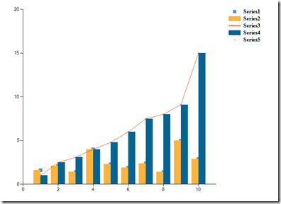
‘+’ allows you to to superimpose things on a chart as in the following example.
lc.scatter(y) + lc.line(y) |> display
Notice how I can superimpose two graphs of a different type and display the result.
Notice on the upper right corner a bizarre (Series1, Series2) legend. What I wanted to do, but didn’t get around to do, was to allow a syntax like
lc.scatter(y) + lc.line(y) + lc.legend(“Players”) |> display
It should be relatively trivial to add it to the code. Also notice that the ‘y’ parameter in the second chart is not needed. Data flows freely from left to right. So you can write the equivalent code below. This is a feature that caused all sort of grief. With hindsight it’s not worth the hassle. That’s why you always need to write your code at least twice to get it right.
lc.scatter(y) + lc.line() |> display
Some other, more elaborate charts follows. Notice how data flows from left to right until I introduce a new variable (i.e. the two lc.boxplot instructions plot different boxplots)
lc.scatter(y, markerSize = 10) + lc.column() + lc.boxplot() + lc.line() + lc.column(x) + lc.boxplot()|> display
Things would be better with names for axis, titles and such. I’m not including them for the sake of simplicity.
lc.scatter(y, markerSize = 10) + lc.column() + (lc.line(x) + lc.column()) + lc.scatter(markerSize = 20) |> display
If you remember the previous post, we talked about boxplots and how you generally want to have more than one on a graph. You can do that with the ‘+’ operator and get this ugly chart. More work is needed here.
lc.boxplot(y = y, xname = "Players", yname = "Ratings", title = "Players' Ratings", color = Color.Blue, whiskerPercentile = 5, percentile = 30,
    showAverage = false, showMedian = false, showUnusualValues = true) +  lc.boxplot(y = x) |> display
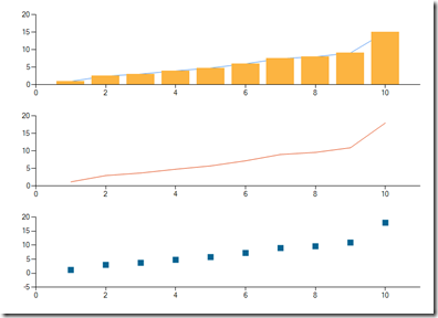
‘++’ allows you to create new charts below the chart you already have as in:
let h = [1.;2.5;3.1;4.;4.8;6.0;7.5;8.;9.1;15.]
let w = h |> List.map (fun h -> h * 1.2)

lc.line(h) + lc.column() ++ lc.line(w) ++ lc.bubble() |> display
Notice the left to right flowing of information here as well. In the next installment we’ll take a look at how things are implemented and why it’s all wrong.


Luca,
Best of luck in your new endeavors! Thanks for your contribution in LINQ, F# etc.
I hope you will still have time to update this blog :)
Petr
I hope so too. Cheers.
Good luck with your new job.
Come stai? non so se ti ricordi di me, ci incotrammo nel lontano 2006 al Twist a seattle (amico/ex collega di Lorenzo, Ivan, Gigi) complimenti per la nuova avventura nel settore finanziario. Sto lavorando piu’ o meno nello stesso ambito e mi spingono molto verso F#, i tuoi post sul light charting sono veramente stupendi!!
Thanks for your kind comments, let’s hope I can start posting again soon. Ciao ciao